Responsive image
https://www.jianshu.com/p/607567e488fc
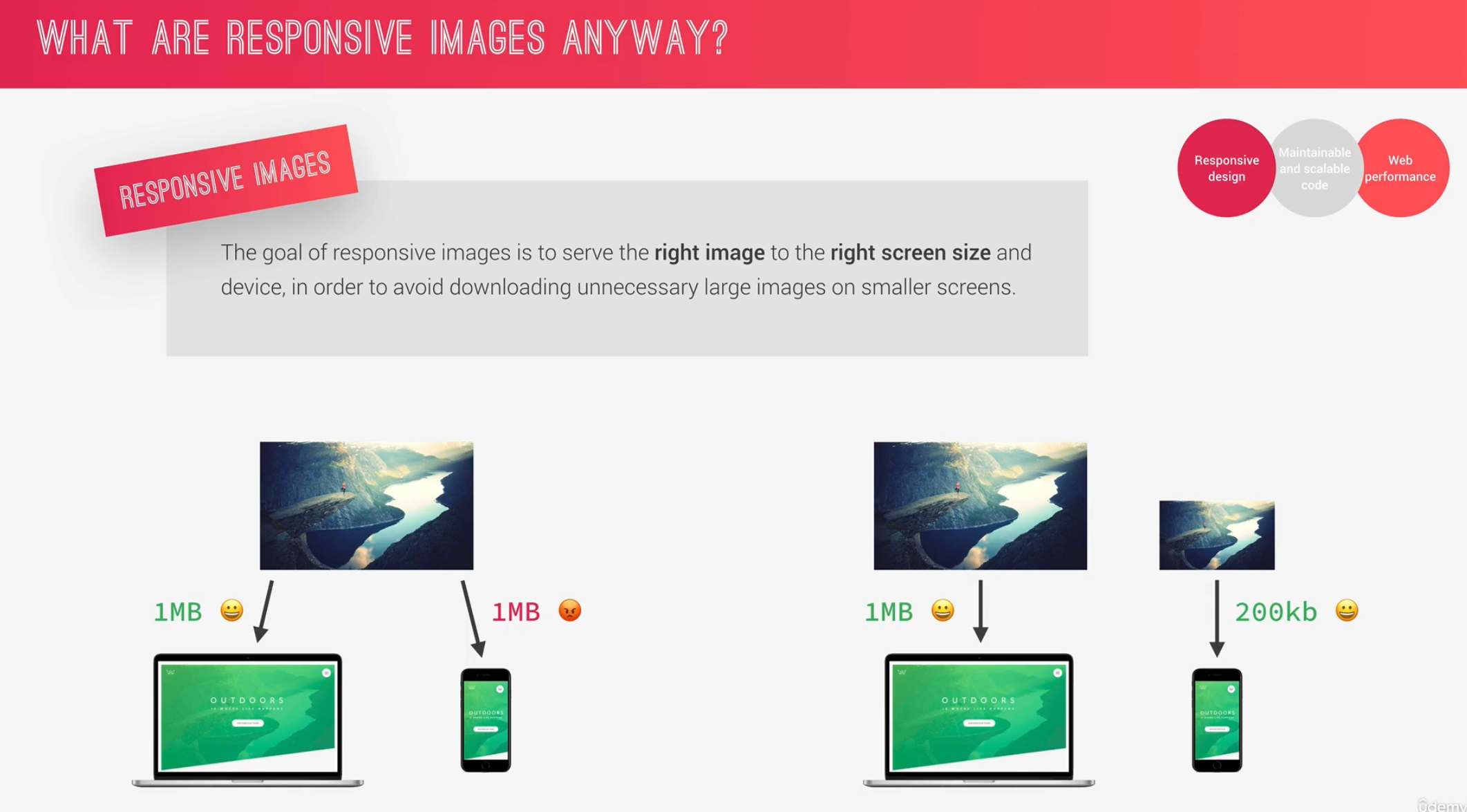
what is responsive image
display different versions of the same image on the different screen size
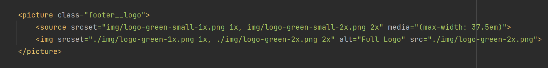
set responsive img - 1
encapsulate it with picture tag
srcset: use with density descriptor to specify different images under different pixel ratio
use width descriptor and sizes to specify different images under different widths
write media query in source tag
if none of the media queries was matched, use img tag
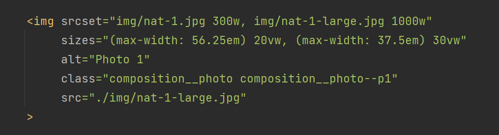
set responsive img - 2
srcset: use width descriptor and sizes to specify different images under different widths
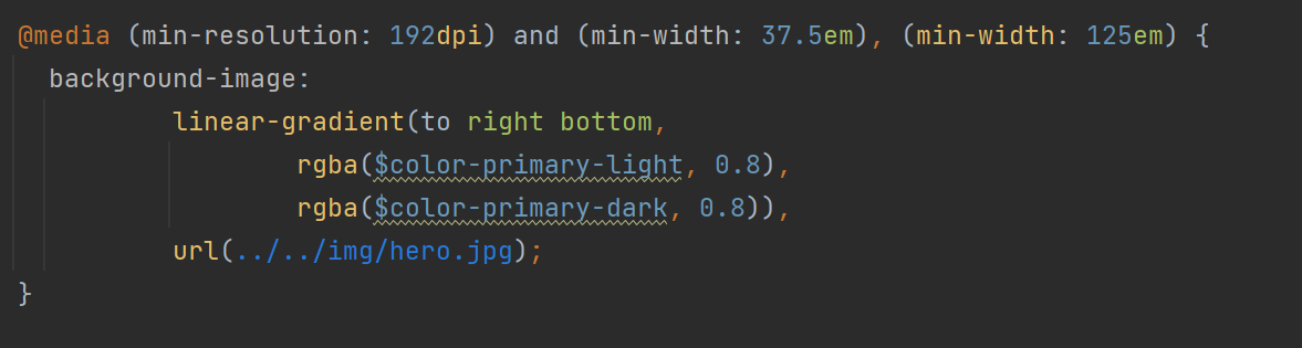
Responsive image in CSS