Advanced CSS&Sass 07 - media query


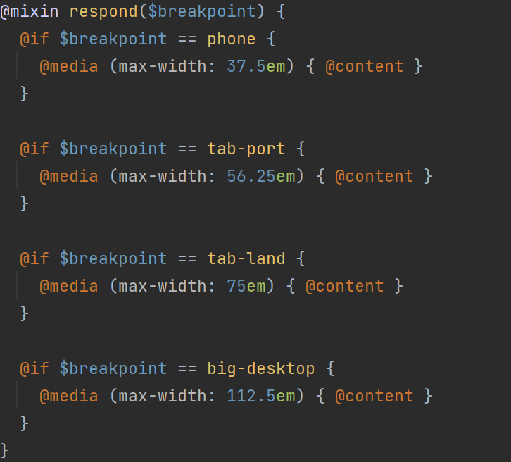
max- and min- width in media query

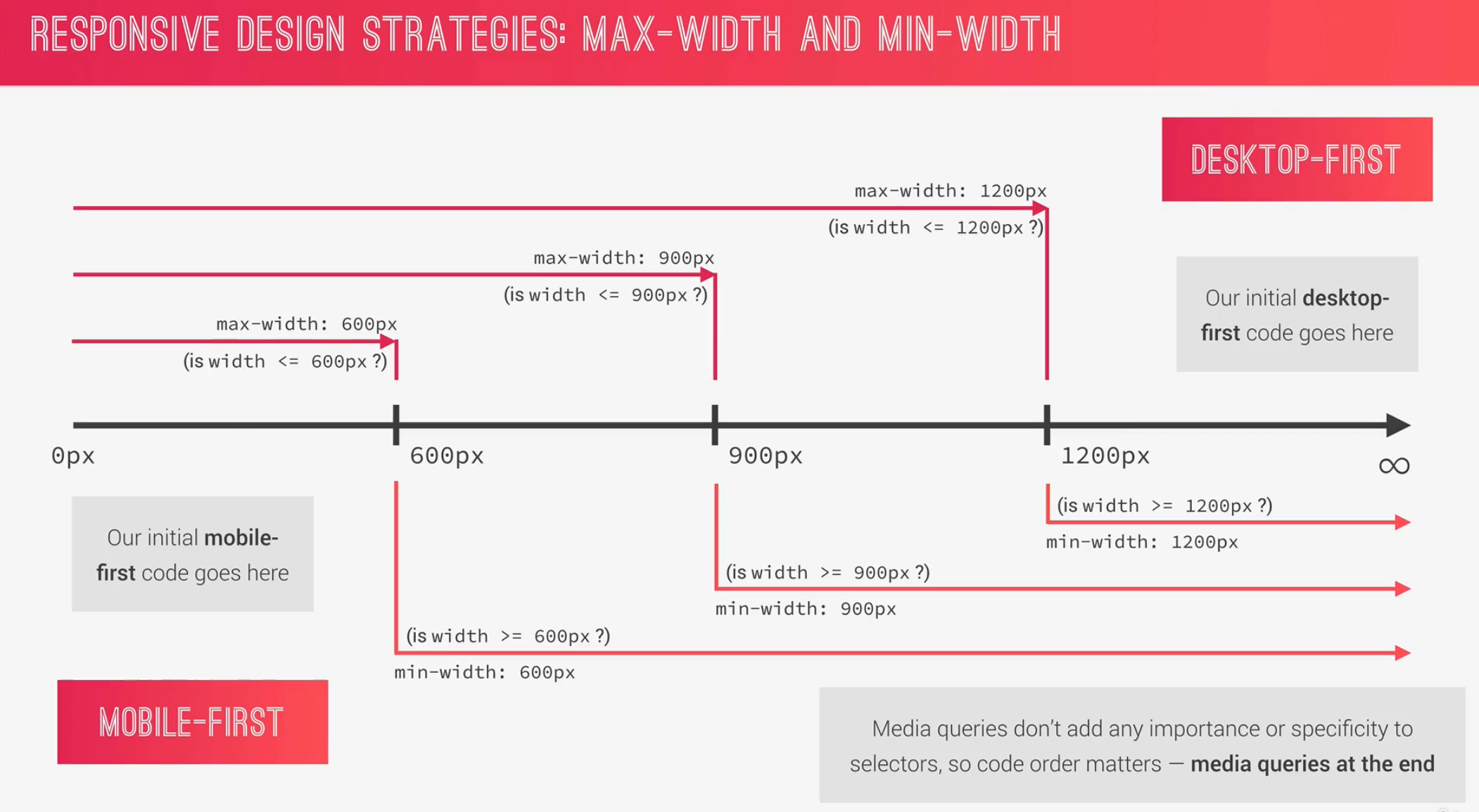
  • in desktop-first, using max-width in media query
  • in mobile-first, using min-width in media query
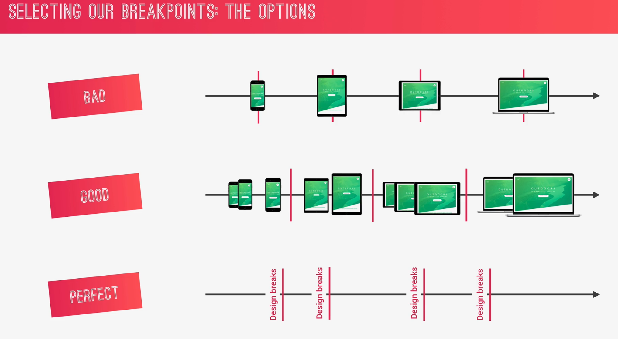
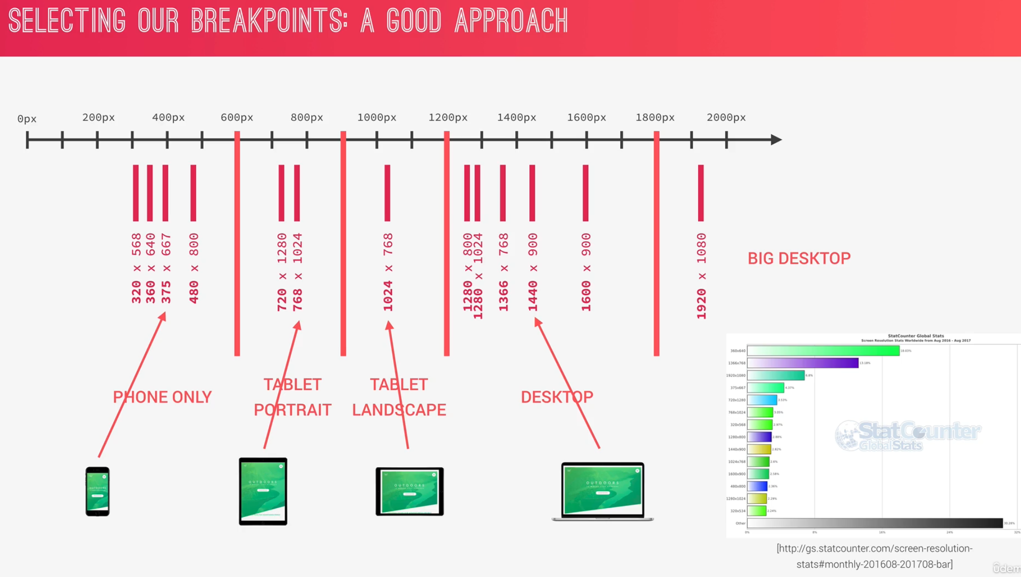
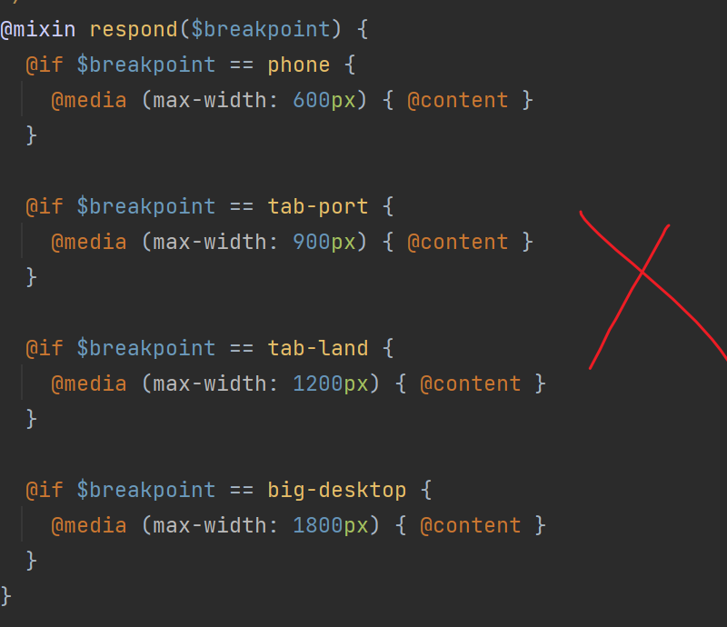
Breakpoint

unit in media query

rem and em in media query would not be effected by our default settings

in media query, use em(1 em = 16px) instead of px:

to

! em in the media query always refers to the default font-size of brower

but em in the element refers to the fontsize of themselves(if there is no, use that of father elements): https://zhuanlan.zhihu.com/p/26955084


A u t h o r: Joe
P o l i c y: All articles in this blog are used except for special statements CC BY 4.0 reprint policy. If reproduced, please indicate source Joe !
Leave Your Comment Here
  TOC