background-clip and transparent color
use the combination of:
background-image:  url(../../img/hero.jpg);
-webkit-background-clip: text;
color: transparent;
to make background image as text:

in emmet, use lorem to generate meaningless place holder

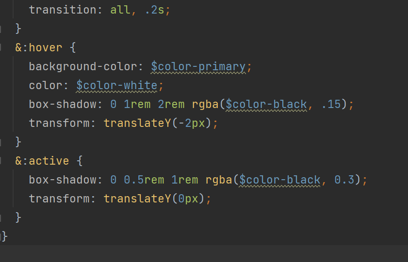
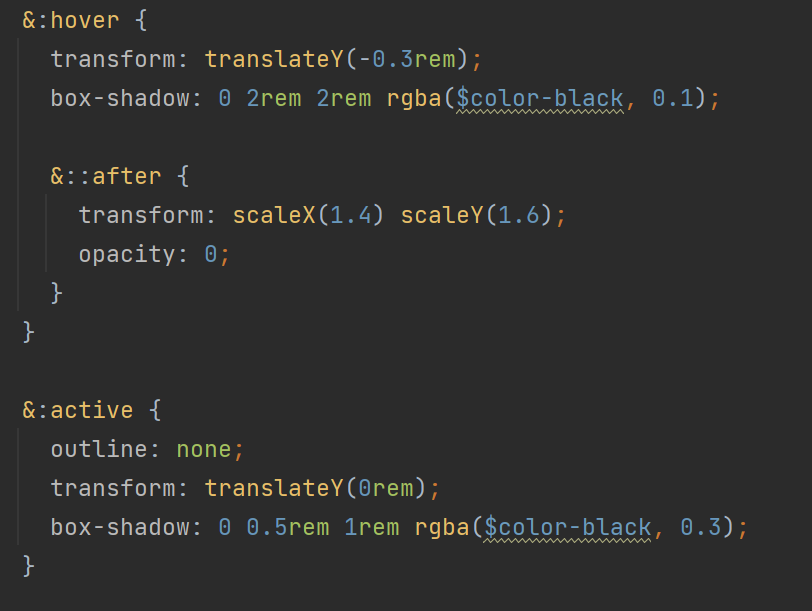
Make clicking a button more dynamic - use shadow and transform
eg1:
eg2:
When father elements use rem, children elements could use %
Outline vs Border
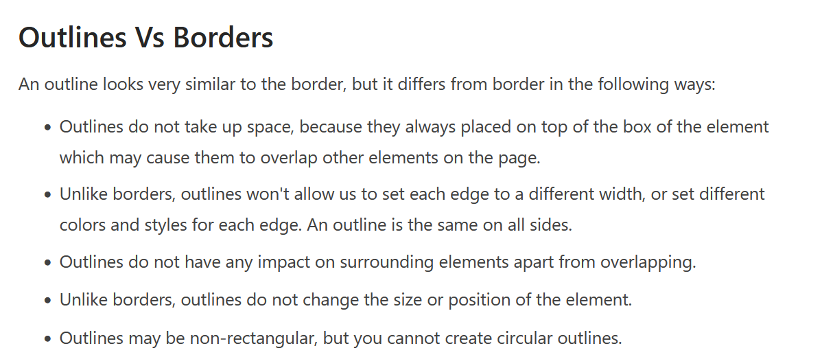
! outline does not effect surrounding elements and does not take up space
Make the flipping card with different content on each side
.card {
  perspective: 150rem;

  height: 50rem;
  position: relative;


  &__side {
    height: 50rem;
    color: #fff;
    font-size: 2rem;
    transition: all .8s ease;
    position: absolute;
    top: 0;
    left: 0;
    width: 100%;
    backface-visibility: hidden;
    border-radius: 3px;
    box-shadow: 0 1.5rem 4rem rgba($color-black, .15);

    &--front {
      background-color: $color-white;
    }

    &--back {
      background-color: green;
      transform: rotateY(180deg);

      &-1 {
        background-image: linear-gradient(to right bottom, $color-secondary-light, $color-secondary-dark);
      }
    }
  }

  &:hover &__side--front{
    transform: rotateY(180deg);

  }

  &:hover &__side--back{
    transform: rotateY(0);

  }
}